
Here are PRIP 8.1 Sumita Arora Solutions for class 12 Computer Science. To view Sumita Arora solutions for all chapters, visit here.
Q.1: Plotting only y-values. The simplest use of pyplot is to plot a list of values on the y axis while letting pyplot choose the x-axis. In this case, pyplot takes one argument and – the list – an optional formatting argument.
(i)First, import pyplot ( write command for it below)
Answer: import matplotlib.pyplot as plt
(ii) Now generate a list ML having 10 elements, but in which each element is the square of its position in the list: Complete the code below:import _______
ML = [ ]
for _ in ____:
ML.append(i*i)
Answer:
Code:
import matplotlib.pyplot as plt
        ML = []
        for i in range(10):
ML.append(i*i)
(iii) Now simply plot the sequence ML with a plot(). That is, run the following code now.plt.plot(ML)
plt.show()
See what happens? Paste the result below:
Answer: 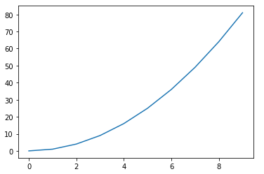
(iv) Save it as the file first.png. Write command below.
Answer: plt.savefig('first.png')
Q.2: Plotting and v-values. To control both the x-axis and the y-axis, you need to provide to lists of the same length – one containing the x values and another containing the y values. For this example, we will use sequences L1 and L2
Sequence L1 is created as : numpy.arange(0, 8, 1)
(i) Sequence L2 contains cos values for each of the value of L1. Write code below to create L2:
Answer: l2 = np.cos(l1)
(ii) Now write command to plot a graph x- versus y- :
Answer:plt.plot(l1, l2)
plt.show()
(iii) What is the result produced by above code? Paste the result below:
Answer: 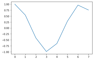
(iv) Save the result in file second.pdf in folder c:\data. Carefully give the path by doubling the slashes. Write command below.
Answer: plt.savefig('C:\data\second.pdf')
(v) Now modify the above code and add a proper title using title() for the chart and for the X-axis and Y-axis using functions xlabel() and ylabel(). (Write code for this below)
Answer:
plt.title('Title for graph') # function to give title to graph
plt.xlabel('values')       # function to add x label
plt.ylabel('cos values')   # function to add y label
Q.3: Plotting multiple line charts in single plot. Create a Python script with following code in it.
import matplotlib.pyplot as plt
import numpy as np
x = np.linspace(0, 10, 100)
plt.plot (x, np.sin(x))
plt.plot (x, np.cos(x))
pit.show()
import numpy as np
x = np.linspace(0, 10, 100)
plt.plot (x, np.sin(x))
plt.plot (x, np.cos(x))
pit.show()
(i) Run the above code and paste its result below:
Answer: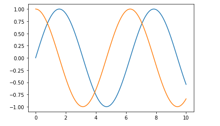
(ii) Add a third line chart to above plot with log values for each value of sequence x i.e., x vs log(x).
Add code for the same in above code:
Answer:
Code:
import matplotlib.pyplot as plt
import numpy as np
x = np.linspace(0, 10, 100)
plt.plot(x, np.sin(x))
plt.plot(x, np.cos(x))
plt.plot(x[1:], np.log(x[1:]))
# plt.plot(x, np.log(x))# this gives error RuntimeWarning: divide by zero encountered in log
(iii) Run the code and paste its result below:
Answer: plt.show()
(iv)Change line style for sin curve as ‘–’ of olive color, for cos curve as ’-’ blue color and continuous line for log curve of silver color. (write code below)
Answer:
Code:import matplotlib.pyplot as plt
import numpy as np
x = np.linspace(0, 10, 100)
plt.plot(x, np.sin(x), '-', color="olive")
plt.plot(x, np.cos(x), '--', color="blue")
plt.plot(x[1:], np.log(x[1:]), color="silver")
# plt.plot(x, np.log(x))# this gives error RuntimeWarning: divide by zero encountered in log
(v) Add legends to above plot, labeling as “Sin curve”, “Cos curve” and “Log curve”. The position of legends should be lower right.
Answer:
Code:import matplotlib.pyplot as plt
import numpy as np
x = np.linspace(0, 10, 100)
sin, = plt.plot(x, np.sin(x), '-', color="olive",label = "sin curve" )
cos, = plt.plot(x, np.cos(x), '--', color="blue", label = "soc curve")
log, = plt.plot(x[1:], np.log(x[1:]), color="silver",label = "log curve")
# plt.plot(x, np.log(x)) # this gives error RuntimeWarning: divide by zero encountered in log
plt.legend(handles=[sin, cos, log], loc= "lower right")
(vi) Paste the result of above command below:
Answer: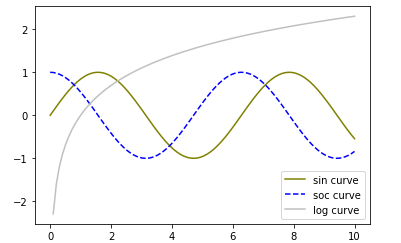
(vii) Save the above figure
Answer: plt.savefig('sin_cos_log.png')
Q.4: Plotting a Bar chart. Sequence preci stores these 12 average precipitation values for twelve months:
17.78, 19.05, 46.99, 74.422, 77.47, 51.308, 49.022, 41.148, 46.736, 33.274, 35.306, 21.336
(i) Write code to create sequence preci given above.
Answer:perci =np.array([17.78, 19.05, 46.99, 74.422, 77.47, 51.308, 49.022, 41.148, 46.736, 33.274, 35.306, 21.336 ])
(ii) Write code to create a sequence Months storing names of twelve months.
Answer:months = np.array(["January", "February", "March", "April", "May", "June", "July", "August", "September","October", "November", "December"])
(iii) Write code to create a bar chart plotting the precipitation values for tweleve months i.e., sequence preci. Months (write code below)
Answer: plt.bar(months,perci)
(iv) Paste the result of above code below:
Answer: plt.show()
(v) Change the above code so that the color of the bar is black and width of bar becomes 0.3.
Answer: plt.bar(months,perci, color = 'b', width = 0.3)
(vi) Also, add titles for the chart, for x-axis and y-axis.
Answer:
plt.bar(months,perci, color = 'b', width = 0.3)
plt.xlabel('Months')
plt.ylabel('precipitation')
plt.title('precipitation in a year')
(vii) Change the ticks on the X-axis so that it now displays month number in place of the month name. (Use xticks())
Answer:
index = np.arange(1,len(months)+1)
plt.bar(index,perci, color = 'b', width = 0.3)
plt.xlabel('Months')
plt.ylabel('precipitation')
plt.xticks(index)
plt.title('precipitation in a year')
plt.show()
(viii) Paste the result below:
Answer: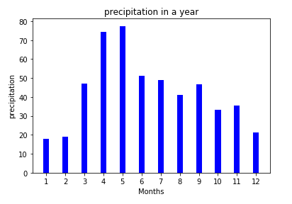
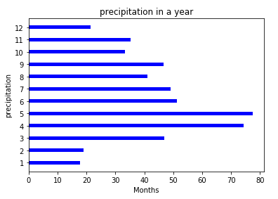
(ix) Create horizontal bar chart using the same data as above (write the code below)
Answer:
index = np.arange(1,len(months)+1)
plt.barh(index,perci,0.3,color='b')
plt.xlabel('Months')
plt.ylabel('precipitation')
plt.yticks(index)
plt.title('precipitation in a year')
plt.show()
(x) Paste the result below:
Answer:
Q.5: Plotting a Pie chart
(i) Use the sequences precipitation and months data from the previous question and plot a pie chart. The Month names should appear on the pie chart ( write code below).
Answer: plt.pie(perci, labels=months)
plt.show()
(ii) Show the June and November months exploded on the pie chart.
Answer:
exploded = (0, 0, 0, 0, 0, 0.1, 0, 0, 0, 0, 0.1, 0)
plt.pie(perci, explode=exploded, labels=months)
plt.show()
(iii) Show the percentages values on the pie chart with 3 decimal points and a percentage sign.
Answer:
exploded = (0, 0, 0, 0, 0, 0.1, 0, 0, 0, 0, 0.1, 0)
plt.pie(perci, explode=exploded, autopct='%1.3f%%', labels=months)
plt.show()
(iv) Paste the result below:
Answer: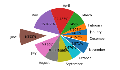
6. Plotting a Multi Bar chart. carefully go through the average data for Mumbai city from the Indian Met department

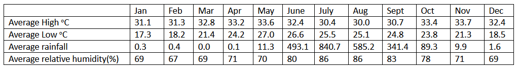
(i) Create sequences HighTmp, LowTmp, RainFall, RelHumid from the above data Write code below:
Answer:
HighTmp = np.array([31.1, 31.3, 32.8, 33.2, 33.6, 32.4, 30.4, 30.0, 30.7, 33.4, 33.7, 32.4])
LowTmp = np.array([17.3, 18.2, 21.4, 24.2, 27.0, 26.6, 25.5, 25.1, 24.8, 23.8, 21.3, 18.5])
RainFall = np.array([0.3, 0.4, 0.0, 0.1, 11.3, 493.1, 840.7, 585.2, 341.4, 89.3, 9.9, 1.6])
RelHumid = np.array([69, 67, 69, 71, 70, 80, 86, 86, 83, 78, 71, 69])
months = np.array(["January", "February", "March", "April", "May", "June", "July", "August", "September","October", "November", "December"])
(ii) Plot these four sequences on a bar chart where red color shows the HighTmp sequence, blue color shows the LowTmp sequence, olive color depicts the RainFall sequence and silver color depicts the RelHumid sequence.
Answer:
width = 0.2
plt.figure(figsize=(10,10))   # to increase size of bar chart
plt.bar(index-0.4,HighTmp, width, color = 'red')
plt.bar(index-0.2,LowTmp, width, color = 'blue')
plt.bar(index,RainFall, width, color = 'olive')
plt.bar(index+0.2,RelHumid, width, color = 'silver')
plt.xticks(index, months) # set labels manually
plt.show()
(iii) Paste the result below:
Answer: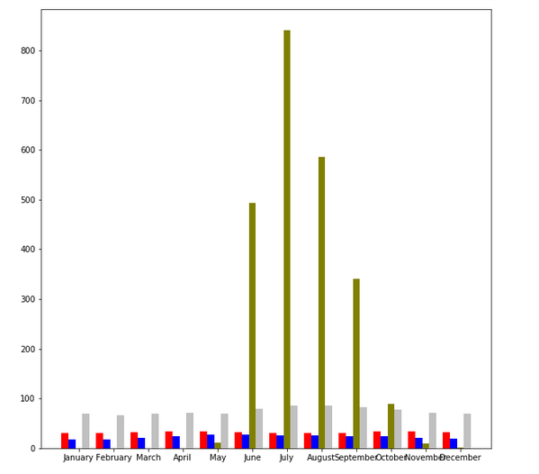
(iv) Make widths of these bars as 0.28.
Answer:
width = 0.28
plt.figure(figsize=(10,10))   # to increase size of bar chart
plt.bar(index-0.56,HighTmp, width, color = 'red')
plt.bar(index-0.28,LowTmp, width, color = 'blue')
plt.bar(index,RainFall, width, color = 'olive')
plt.bar(index+0.28,RelHumid, width, color = 'silver')
plt.xticks(index, months) # set labels manually
plt.show()
(v) Change the Xticks such that they display the month names ( numbers ) in place of month names
Answer:
width = 0.28
plt.figure(figsize=(10,10))   # to increase size of bar chart
plt.bar(index-0.56,HighTmp, width, color = 'red')
plt.bar(index-0.28,LowTmp, width, color = 'blue')
plt.bar(index,RainFall, width, color = 'olive')
plt.bar(index+0.28,RelHumid, width, color = 'silver')
plt.xticks(index)
plt.show()
(vi) Paste the result below:
Answer:
(vii) Add legends for these providing meaningful labels for these sequences.
Answer:
width = 0.28
plt.figure(figsize=(10,10))   # to increase size of bar chart
plt.bar(index-0.56,HighTmp, width, color = 'red')
plt.bar(index-0.28,LowTmp, width, color = 'blue')
plt.bar(index,RainFall, width, color = 'olive')
plt.bar(index+0.28,RelHumid, width, color = 'silver')
plt.xticks(index)
handles = ["High Tmp","Low Tmp","Rainfall","Rel Humid"]   # legends added
plt.legend(handles)

plt.show()
(viii) Give appropriate title for the chart and the axes.
Answer:
width = 0.28
plt.figure(figsize=(10,10))   # increase size of graph
plt.bar(index-0.56,HighTmp, width, color = 'red')
plt.bar(index-0.28,LowTmp, width, color = 'blue')
plt.bar(index,RainFall, width, color = 'olive')
plt.bar(index+0.28,RelHumid, width, color = 'silver')
plt.xticks(index)

plt.xlabel('Months')                          # xlabel ylabel title
plt.ylabel('temp/humidity/rainfall')
plt.title('Rainfall in a year')

handles = ["High Tmp","Low Tmp","Rainfall","Rel Humid"]   # legends added
plt.legend(handles)
plt.show()
(ix) Paste the result below:
Answer:
(x) Save the chart as “multibar.pdf”.
Answer:# image should be saved before plt.show()
plt.savefig('multibar.pdf') # saving figure
Clear Doubts with Computer Tutor
In case you’re facing problems in understanding concepts, writing programs, solving questions, want to learn fun facts | tips | tricks or absolutely anything around computer science, feel free to join CTs learner-teacher community: students.computertutor.in